DRACONIAN PROCESS no.4

Welcome to page four of the New Draconians. As you can see, I’ve reverted back to the widescreen approach. This page illustrates an interesting transition: Letting both color and special effects do the heavy lifting and define the page visually.
I’ve been penciling and inking my own pieces for over twenty years, so my natural inclination, my default setting if you will… is to create in black and white. But now, having decided to color my own work opens up new opportunities. It literally forces you to rethink your process from the ground up.
It was a conscious decision from the design stage to focus on a dramatic shot of the orbital skimmer streaking towards the reader above the earth. I’m fairly happy with the mechanics of the ship knowing full it would visually pop once the color was added. Even more so once I decided to make the conscious decision to go with a stock photograph of earth at low orbit.

Like most creators, Photoshop is the go to program to color my work. I specifically color in different layers for each panel of the page. Although my medium is comics, visually I want my work to look like animation. How I achieve this look is to use a bright palette, with opacity levels close to 100 percent for characters or objects in the foreground, while creating a layer, or in some cases multiple layers in the background where I can adjust the opacity accordingly. By doing so allows both figures and objects in the foreground to take prominence while simultaneously giving the backgrounds depth. That trick worked for the stock photo of earth quite nicely. Reducing the opacity on the photograph allowed the ship to pop even more and I was happy with the overall result.
The second panel, which is an internal establishing shot, pushes the envelope even further. Every panel is an opportunity to visually wow the reader if you can. Even if the panel is inherently static. Visually I thought it would be cool to illustrate the interior of the ramjet with “view screen” sensors. Allowing the passengers to enjoy the breathtaking views of flying in low earth orbit. So the figures and the immediate background are in one layer, while further back into cabin the color is in a second layer, while another stock photo of earth taking up the background and view screens are in the third layer. The contrast is subtle, but the discerning eye can see it.

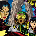
The next two panels, I went in for close-ups, for a sense of urgency as an alarm is going off. The panels are devoid of backgrounds… we don’t need it. We know exactly where the characters are at this point. Since bright red is a universal cue for danger I went with that. Colored the backgrounds bright red, then I colored the characters as I normally would in their natural hues. Then I created a second layer of red, overlaid it over the figures, and reduced the opacity to such a degree that the underlying primary colors would come through but you still had a red tint over everything. That turned out to be an easy no muss, no fuss way of achieving the “Danger Will Robinson!” effect I was going for.

The last panel was a bit of a misstep, recovery and finally a revelation. Again, even at the design stage I knew I wanted to use another stock photo of earth. However while penciling I decided to draw an effect that conveyed speed. After careful consideration, I decided to remove that drawn effect. I needed to simplify the panel. Almost by accident I decided to motion blur the stock photo of earth and again reduced the opacity in a separate layer to make the attacking drones stand out. The motion blur tool effectively turned another perfunctory panel into something a little bit visually exciting.


Finally, I’d like to talk about overall page design. I was taught early on that whenever possible you should visually guide the reader’s eye from the upper left of the page to the lower right. It’s almost a subliminal cue to make the reader turn the page. Even with webcomics the rule remains the same. Notice how the ramjet breaks the panel and leans into the cabin interior panel? In turn the perspective of the cabin interior panel flows into the direction of the “alarm” panels. Finally the drones themselves arc downward and out. All intentional, and designed for the eye to flow effortlessly from top to bottom. This is a design staple I will refer to again and again so be prepared!
Well enough creative rambling this time around.
Want to see the finished product and how the story is progressing? By all means check out THE NEW DRACONIANS on Tumblr:
http://newdraconians.tumblr.com/
And if you can, please support my efforts on Patreon, I’d greatly appreciate it!